The GUI

Now it’s time to log in to nedi, with the default admin/admin account, if you haven’t already done so.
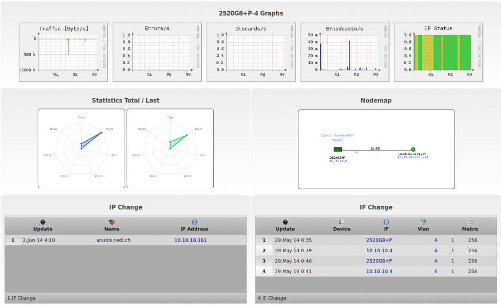
After some discoveries the nodes should be assigned to the correct switch ports and the graphs start showing up.
Modules can be enabled/disabled and assigned to groups in nedi.conf. The default settings show device related tools to the left, node , report and monitoring stuff in the middle and user and other stuff to the right. A user only sees menus or functions according to the assigned groups, which are:
| Group | Section | Description |
|---|---|---|
| adm Admin | – | Add, update and delete information as well as sending commands to devices (possible in several modules) |
| mgr Manager | – | Configuring operational settings via SNMP |
| mnt Maintenance | – | Configuring informational settings via SNMP |
| net Network | Devices, Topology | Access device related modules, which cover realtime and topology aspects |
| dsk Helpdesk | Nodes | Access node related modules, including tracking stolen nodes. |
| mon Monitoring | Monitoring | Use the monitoring system. They’ll also be notified, if email and mobile# is set in the profile and notification is set accordingly |
| oth Other | Other | Applies to every module in the Other menu, but can also be used to prevent using generic modules like phpinfo, if the user is kept out of this group |
As you may have noticed, each module has a bigger icon on the left side of the input form. If you hover over it, the module name pops up. More complicated forms display more information as you hover over certain areas (see Devices-Map for example).
You’ll find access to the context help, the print function and XLS export (where available) on the top right corner, next to your login.
Colored Times
An interessting feature is Age Shading ® It visualizes timestamps in colors based on the retire settings in nedi.conf:
-
The greener the background (e.g. first seen) is, the more recent the event (it’s like a fresh fruit)!
-
The more red the background (e.g. last seen) is, the older the event (bright red is almost aged out).
-
The more blueish such fields are, the longer the timespan they describe (in other words its static kinda like the sea).

Bookmarks
Most modules allow bookmarks to be set for easier, repeated access. So you can have your device list look the same, even though the actual data gets updated each day. The notebook icon on the top left allows you to append a link of the current view to the Admin Message. All you need to do is to replace the word “EDIT” with a meaningful name. Upon login you’ll land on User-Profile by default. This is intentional, since this page is accessible for all users and the only place where the Admin Message can be seen…
In case your devices don’t seem to be supported, have a look at expanding NeDi to fit your needs.

